

Kualitee — Why the Sign-Up page was leaking conversions
Product Design | B2B SaaS | 2026
A three-way design critique of a real SaaS sign-up form — and what the right redesign actually changes.
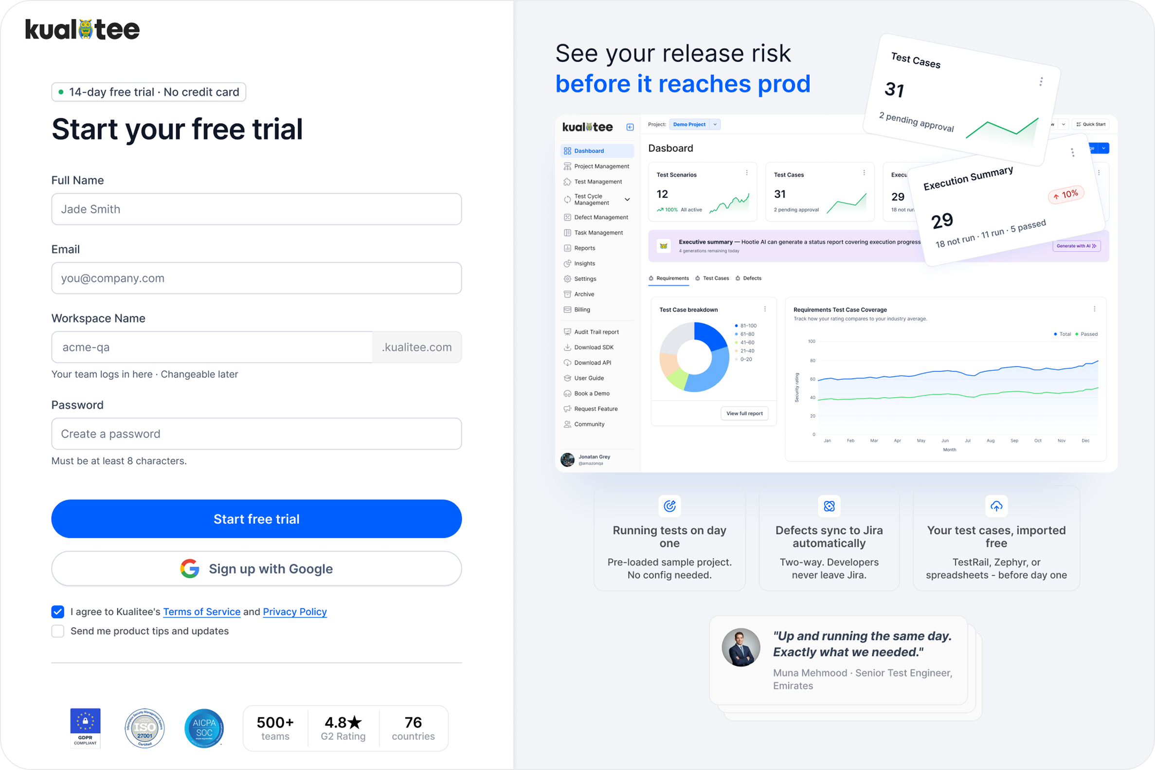
Project snapshot
Product: Kualitee — B2B SaaS for software testing teams
Focus: Sign-up page / trial activation
My role: Product Designer (UX/UI, flows, conversion design)
Core metrics to optimise: visitor-to-trial conversion rate (industry avg 2–5%, target: top quartile >11%), form completion rate (drop-off by field), trial-to-paid conversion rate
Versions compared: Current live design → Client's proposed redesign → My redesign
The real question
When a QA manager lands on your sign-up page, what are they thinking?
Not "I need a release-ready project." They're thinking: "We keep shipping bugs. My team is drowning. I need something that works before our next release cycle."
So the design question isn't "how do we make the form look better?" It's: why would this person hesitate — and what can we remove to make hesitation harder?
Version 1: The original live page
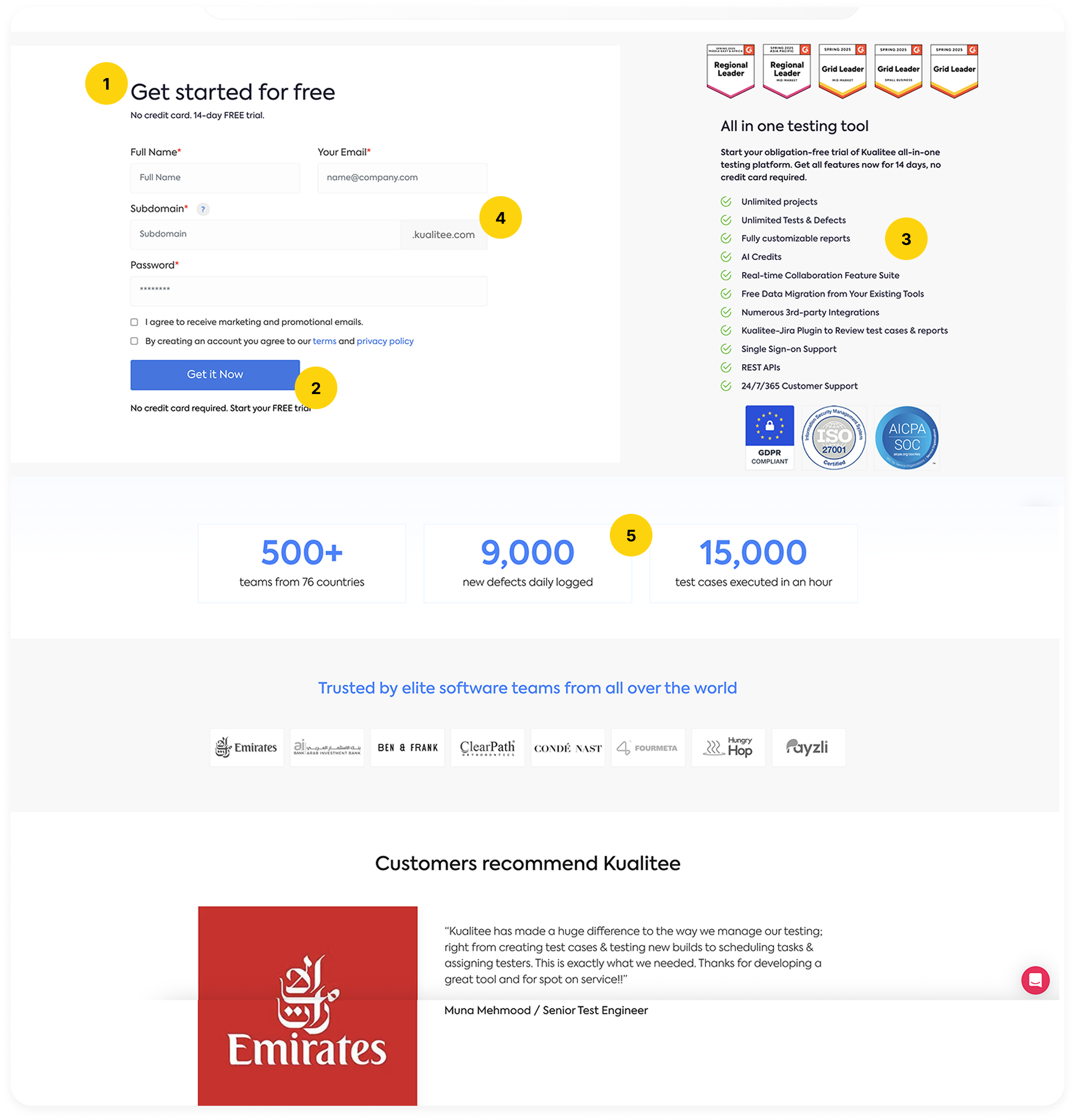
SignUp page of Kualitee.com
It looks fine: two columns, form on the left, benefits on the right. Clean and... forgettable.
The headline: "Get started for free."
Every SaaS product says this. It's the design equivalent of "Welcome!" — technically correct, but completely empty.
The CTA: "Get it Now."
"Now" implies urgency. B2B buyers don't want urgency — they want confidence. "Now" sounds like a flash sale, not a professional tool.
The right column has 11 feature list.
Unlimited projects, AI credits, 24/7 support, etc. — everything listed, nothing prioritised. When everything is important, nothing is.
The Subdomain field with a tooltip.
This asks for a permanent decision before the user has seen the product once. The tooltip explains what the field is, but not why it shouldn't frighten them. Some users will pause here, some will leave.
Trust signals are below the fold.
G2 badges, client logos, ISO certification — all placed after the form, far from the moment of doubt. Social proof only works when it's next to the hesitation.
The right column tries to sell, the left column asks, but they don't speak to each other. The user is left to make the connection on their own. Some do, many don't.

By the numbers
The average SaaS sign-up conversion rate is 2–5%. Top performers convert above 11%. That gap is rarely about traffic quality — it's about friction. Reducing form fields from 7 to 3 increases conversions by 20–35%. A single focused CTA converts 32% better than pages with two or more competing actions.
Version 2: The client's proposed redesign
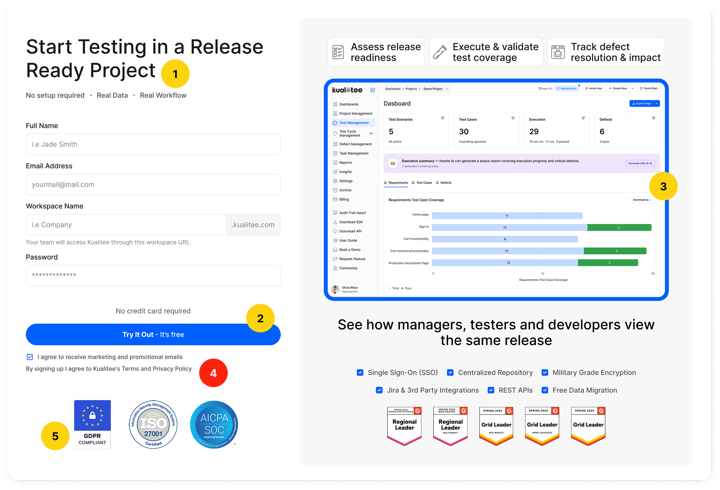
Client's version
Visually, it's a step forward: the screenshot is prominent, the layout breathes more, but when you look through a conversion lens, the strategic problems are still there — and two new ones were added.
The headline: "Start Testing in a Release Ready Project."
Product-speak. It describes the tool's state — not the user's problem. Nobody arrives thinking "I need a release-ready project", they arrive thinking "I need to know our next deployment is safe."
The CTA: "Try It Out — It's free."
This creates a false expectation: Kualitee isn't free — it's a 14-day trial. Telling users "it's free" and then revealing the pricing later is a trust break. The user feels misled, not converted.
The dashboard screenshot instead of a list of features.
Genuinely good — showing the actual product reduces uncertainty.
The marketing checkbox is now pre-checked. The Terms & Conditions checkbox has been removed entirely.
This matters more than it might seem. Pre-checked consent for marketing is a dark pattern — it manufactures agreement the user never actively gave. And removing the T&C checkbox isn't a simplification. For a product operating across 76 countries, it's a GDPR violation. The EU's General Data Protection Regulation requires explicit, informed consent — a pre-ticked box doesn't qualify. This exposes the company to regulatory risk in every European market it operates in.
G2 badges moved further down.
In the original design they were at least near the form. Here they've drifted below it. A step in the wrong direction.

Design that doesn't change behavior isn't redesign — it's restyling, and design that introduces legal risk isn't an improvement at all.
3 questions before my redesign:
Who is actually signing up?
A QA Lead or Engineering Manager. Technical enough to evaluate the tool, senior enough to care about team workflow and release risk. Not impulsive. Cautious. They need permission to trust.
What is the moment of truth?
It's not the button. It's the second before the button — when the user weighs "is this worth my time and my team's data?" Everything on the page either adds to that confidence or subtracts from it.
What is Kualitee's real value?
Not unlimited tests. Not REST APIs. The actual value: you'll know your release is safe before it reaches production. That's a risk-reduction story, not a feature list.
Version 3: My redesign
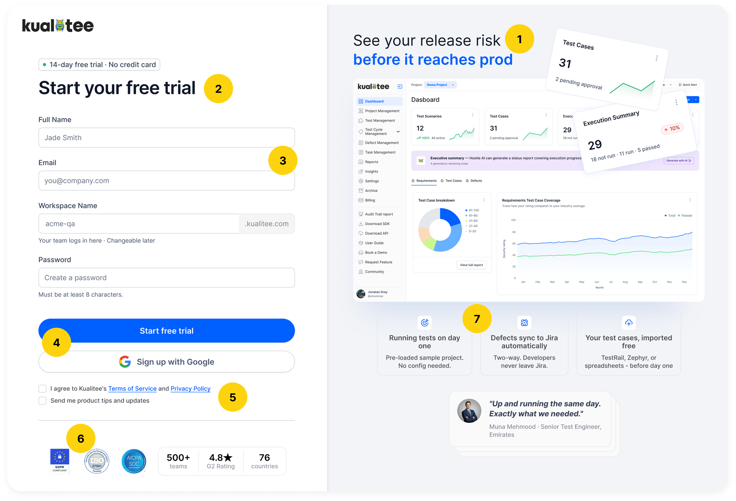
Olga's version
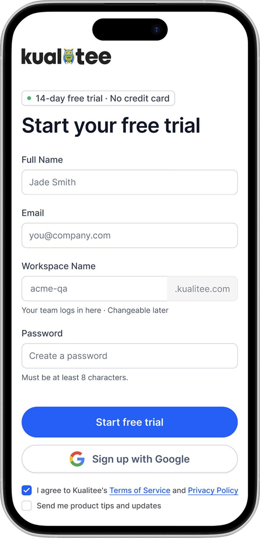
The page headline: "See your release risk before it reaches prod."
This is the outcome language, not feature language. It speaks to the QA manager's real fear and positions Kualitee not as a testing tool, but as a risk-visibility system.
The form title: "Start your free trial."
Honest and accurate. The original said "Get started for free" — which blurs the line between a free product and a free trial. The client's version swung the other way entirely: "Start Testing in a Release Ready Project" is product-speak that describes an internal state, not an action the user is about to take. Neither title is oriented around the user's actual next step.
"Start your free trial" sets the correct expectation clearly: this is a trial, it's free, and you're starting it now.
But it isn't doing this alone: directly above it sits the badge: "14-day free trial · No credit card." The badge handles the objections — the form title confirms the action. Together they work as a system — neither would be as effective without the other.
This is the broader point about conversion design: no single element is the hero. What changes behaviour is alignment — every element saying the same thing, in the right order, at the right moment.
The form with same 4 fields: Full Name, Email, Workspace Name, Password.
The Workspace Name field stays, but with honest microcopy: "Your team logs in here · Changeable later." These words remove the permanence anxiety without removing the field.
The CTA: "Start free trial."
It's very common for SaaS & simple to understand — it gives no urgency, no false promise. It's accurate and confident. And below it a Google sign-up option for one-click authentication (can be expanded — this is more about the client's capabilities).
Two checkboxes — Terms & Conditions, and product tips — both unchecked.
The "product tips" checkbox is straightforward — marketing and communication consent must always be opt-in under GDPR. Pre-checking it is a dark pattern, full stop.
T&C is less obvious. Some argue pre-checking it is acceptable because it's a contract acknowledgment, not marketing consent. But in practice, the safest and most honest approach is to leave it unchecked too. The form won't submit without it — so the friction cost is effectively zero. The legal protection, however, is real. Most products users actually trust — Notion, Linear, Figma — don't pre-check T&C either. There's no good reason to be the exception.
Both unchecked make the entire product look clean, legally sound, and consistent with what a cautious B2B buyer expects from a product they're about to trust with their team's data.
Social proof: directly below the CTA.
500+ teams, G2 rating, 76 countries, and security badges are now not at the bottom as decoration, but at the point of decision, where doubt actually lives.
The right side column: 3 outcome callouts, not 11 features.
- Running tests on day one. No config needed.
- Defects sync to Jira automatically. Developers never leave their workflow.
- Your test cases, imported free. TestRail, Zephyr, spreadsheets — before day one.
Each one answers a specific adoption objection. And below them one real and trustworthy customer quote that does more conversion work than all 11 checkmarks combined.
By the numbers
Shortening sign-up forms boosts B2B conversions by 27% on average. When Imagescape reduced their form fields from 11 to 4, conversion rates increased by 120%. Adding trust elements like "No credit card required" directly adjacent to the CTA reduces drop-off at the moment of highest hesitation.
A note on the right column's actual job.
The sign-up page right column is often treated as a second landing page — a place to explain features, list benefits, convince. That's the wrong mental model.
By the time a user reaches the sign-up page, convincing is done — and this is actually the landing page's job. The user is already interested — they just need one last reason not to leave.
The right column's real job is to give the buyer a final good impression of the product. Not to educate — to reassure.
This becomes even clearer on mobile. On mobile, the right column doesn't exist at all — it disappears entirely in 99% of cases. Which means anything placed there cannot be load-bearing information. If your sign-up page only works when the right column is visible, it doesn't really work.
In my mobile version, there's no right column. Just the form, the CTA, and the trust signals below it (not visible on the screenshot). Everything a user needs to decide, and nothing they don't.

What this redesign is actually about
This isn't really a form optimisation, it's more a trust architecture. Every element either adds confidence or removes doubt. The decisions follow from that:
- Outcome language over feature language
- Honest microcopy over silent permanence
- Social proof at the point of hesitation, not the footer
- A CTA that's accurate, not just catchy
The broader point:
The gap between a 2% and an 11% sign-up conversion rate is rarely about design taste — it is how well the page understands the user's risk model, and how directly it addresses that risk. A sign-up page isn't a form, but a sequence of micro-decisions. Design it accordingly.
Before redesigning any SaaS sign-up form, answer these questions:
1. Who is actually filling this form?
Not the end user — the buyer. In B2B, these are often different people with different concerns. The person signing up for a QA tool isn't thinking about features — they're thinking about team risk, setup time, and whether this decision will hold up when their manager asks about it. Design for the person making the commitment, not the person who will eventually use the product daily.
2. What does success look like for this specific form?
Not all sign-up forms have the same job. Some optimise for volume, some for quality, some for speed-to-activation. Knowing your target metric changes every decision — how many fields to include, where to place social proof, what the CTA says. Without a clear definition of success, you're just rearranging elements and hoping.
3. Does every part of the form build trust — not just visually, but fully?
Trust on a sign-up page isn't just about looking credible. It's the headline setting honest expectations. It's microcopy that removes anxiety about permanent decisions. It's consent checkboxes that respect the user's autonomy and your legal obligations. One element that breaks trust — a misleading CTA, a pre-checked marketing box, a field with no explanation — can undo everything else on the page. Trust is the sum of all the small things done right.
Sources:
- HubSpot — Which Types of Form Fields Lower Landing Page Conversions? — analysis of 40,000+ landing pages
- Heap — What is a "good" conversion rate for your signup flow? — data across 79 SaaS companies
- Klipfolio — SaaS Sign-Up Rate Benchmarks — industry benchmark data (2–5% avg, >11% top performers)
- Imagescape — Form Fields Case Study — 11 fields → 4 fields, 120% conversion increase
